Calculate Relative Strength Index (RSI) and chart with Candles using Python, Pandas and Matplotlib
May 4, 2022
To progress the Snappin’ Necks and Cashin’ Checks series, I’ll be using Python and Pandas to calculate the Relative Strength Index (RSI) for a given ticker and time period, then charting those calculations using Matplotlib.

I guess this is where things get a little messy, so I’ll start with the basics. First, the standard disclaimer: I’m not an analyst and this article is not intended to suggest trading assets at any level…I’m just a programmer that enjoys applying programming logic to real scenarios, such as market analysis. That said, let’s get into it!
Starting with Investopedia, the article Relative Strength Index (RSI) by Jason Fernando, the definition of RSI is:
The relative strength index (RSI) is a momentum indicator used in technical analysis that measures the magnitude of recent price changes to evaluate overbought or oversold conditions in the price of a stock or other asset.
In a previous article, I wrote about charting the comparison of 50 and 200-day moving averages. I want to continue adding more analytical tools such as this to the proverbial toolbelt. While walking the dogs, I listened to a podcast where JC Parets of AllStarCharts.com was being interviewed, and he indicated that the RSI was one of his principal indicators, so off I went…Honestly, when you don’t know anything, like me, its best to just take whatever you can get and see if you can make it work. So, without anyone or anything indicating a contrary argument, why not figure this one out?
The RSI is a fairly simple formula, but is difficult to explain without pages of examples. Refer to Wilder’s book for additional calculation information. The basic formula is:
RSI = 100 — [100 / ( 1 + (Average of Upward Price Change / Average of Downward Price Change ) ) ]
At first, I took this literally, in that it is a “fairly simple formula”, but programmatically, it had a challenge or two…nothing too complicated though. That said, I did have to look at Wilder’s book to best understand the formula. Another Investopedia article, break’s down the formula and analysis a little better. I was able to download Wilder’s original book in PDF format, which contains a wealth of other analytical tools, so I think I have a few week’s worth of exercises to complete! For the sake of this article, however, Wilder’s definition is the best to use. Honestly, just Google the title with “PDF” and you’ll find it too. I don’t want to break any copywrite rules, so will not post it here. What’s amazing though, is that all of Wilder’s calculations and charts were done entirely by hand!

I also referenced an article I found Calculating the RSI in Python: 3 Ways to Predict Market Status & Price Movement by Zach West, and it is a far better reference than anything I could duplicate here. Definitely check it out. As for this article, remember that I am writing this for me to learn the process…hopefully, this will give a good foundation, but Zach’s article is worth the read.
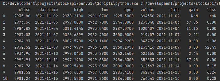
First, load the data into Pandas and setup the data frame, then, iterate through each of the days and determine whether the day is an UP day (the close price is higher than the previous close) or a DOWN day (the close price is lower than the previous close). Also, just a note about the code, there are far more efficient ways achieving the results, but the way that I have coded it is for purely transparent explanation. Once the data frame is loaded, the index set to the date, I’ll send the data frame to a function that will add the UP or DOWN logic for each row. I’ll skip the first row because there is no prior close for that day, but starting with row 1, I iterate over each of the rows in the data frame and check whether yesterday’s close [i-1] is greater than today’s close [i]. If today’s is greater than or equal to yesterday’s close, it is an UP day: df[‘gain’]. If yesterday’s is greater than today’s, it is a DOWN day: df[‘loss’]. It then returns the complete data frame back to the calling function.
So far, so good. The gains and losses are calculating correctly, so now to move onto the second part, which is taking the averages. Here’s where it becomes a little tricky. I need to take the first 14 days and calculate the average gain and the average loss for that time period. Why it’s tricky is that I need to change the calculation AFTER 14 days so that it the going forward average is now the prior average plus that day’s gain or loss.
I am passing the period, which is almost a constant at 14 days, to the function, along with data frame with the daily gains and losses calculated. The function will iterate over the first 13 rows, but on row 14, it will count backwards (13, 12, 11, 10, etc.) to sum the total gains and total losses and divide by the period (14). After row 14, it changes by using the prior average and adding the current day before dividing by the period.
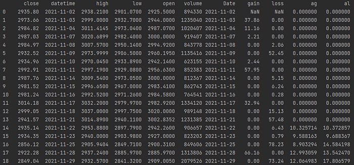
Wow! That was a little tricky, but there’s still a little complexity left to go…calculating the Relative Strength (RS) and Relative Strength Index (RSI). To do this, we need to simply divide the average gain by the average loss to get the relative strength. Once we have the Relative Strength, we need to follow the formula to get the relative strength index:
Done!
And, now the fruits of our labor:

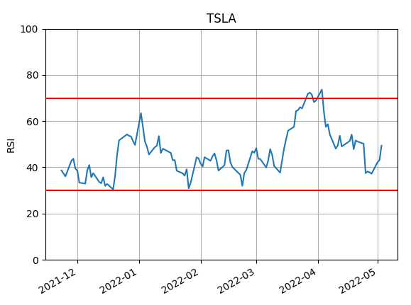
To chart this, I’ll write a function to pass the data frame with RSI included to a simple plot chart and also add a line to distinguish the 70 and 30 percent thresholds.
Which gives the following chart:
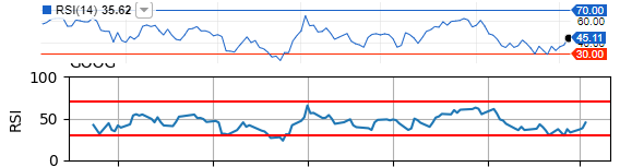
Finally, a side-by-side comparison of my chart (lower line) with the same chart and time period from Fidelity’s website. I have to admit that they are more or less identical, so I am happy with the results! My line is a little fatter, the skew is slightly off, etc.. But, other than the cosmetic differences, the chart is identical.
I think we nailed it!

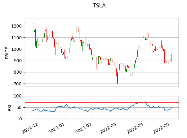
The last step is to have RSI and candles side-by-side in a single chart. To do this I reformatted the code to make the data frame more consistent and charting a little more obvious. You can download the code here. Below is the gist for the final chart, where I am drawing the top chart as the candlesticks for the six month period and a 14 day RSI charted below it.
This gives the following chart:
Now that the charting is done and is reliable, the question is how to interpret the chart. For that, I’ll be going back to Wilder’s book, but that’s not the scope of this article. Here, I am happy to have achieved the above results and am eager to apply it to the market.
Happy coding!
Originally published at https://insurtechprogramming.com.